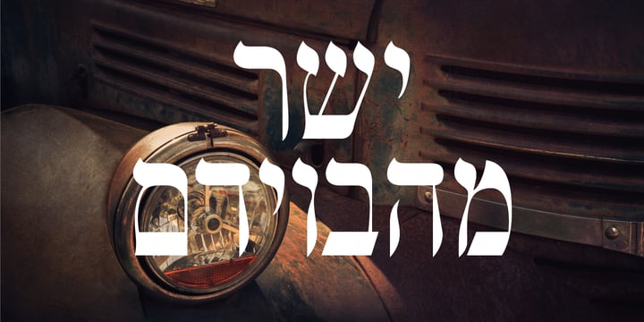
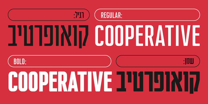
Cooperative is a retro style poster font in Hebrew and Latin. Is based on a printed example of a vintage handmade wood type from the 1950's. This sans serif font is available in both regular and bold versions, with a dirty and grungy styles as well in regular and bold.
Showing posts with label Hebrew. Show all posts
Cooperative fonts from Hafontia - (ijecv)
MF Shtetl fonts from Masterfont - (nzyfv)
Inspired by traditional old Biblical type, this font has a rich and unique style, with modern touch.
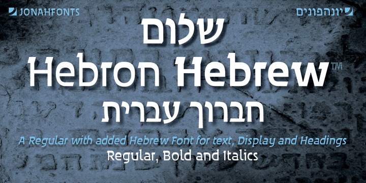
Download Hebron Hebrew Fonts Family From Jonahfonts
Hebron Hebrew is a font that contains the 22 Hebrew letters along with the five final letters that are automatically activated when used in Applications like Apples' Pages and MicroSofts' Word. They do not contain "Niqquds" (Hebrew Vowels). The latin letters have been designed to enhance the Hebrew letterforms.
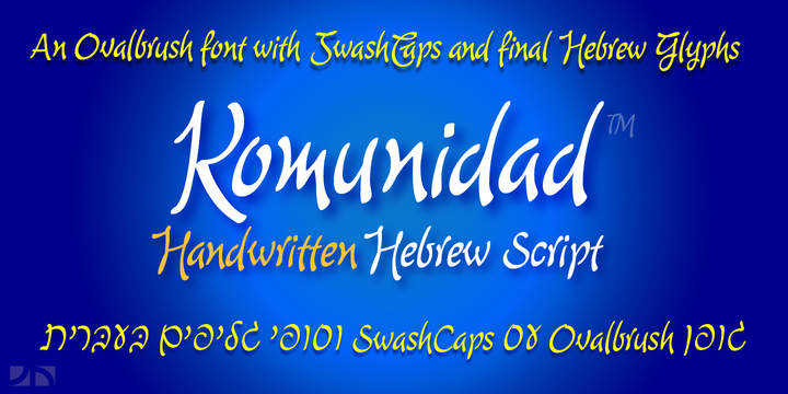
Download Komunidad Hebrew Script Fonts Family From Jonahfonts
Komunidad is the Hebrew version of ”Quintana Light”.
Suitable for logos and packaging statements.
Invoking the OpenType / CONTEXTUAL variant produces the word terminals for all lower-case letterforms as well as diacritic letters. Final Hebrew Glyphs are also added. This can be done individually for each letter as well.
Komunidad also contain alternative Swashes and TabOldstyle numerals.
(OpenType-Variants may only be accessible via OpenType-aware applications.)
Download Katlynne Fonts Family From Ryan Williamson
October 16, 2019
alternating contrast
,
Display
,
experimental
,
eye catching
,
Hebrew
,
reverse contrast
Katlynne is unpredictable.
Katlynne is erratic.
Katlynne is beautiful.
Katlynne is an alternating contrast, sans serif type family. Arbitrarily separating the characters into ‘rounder’ and ‘straighter’ letterforms to determine what contrast each glyph will take.
Katlynne is inspired by the observations made while watching the inexperienced use of broad tip pens. I found how and when individuals rotated their pen gave a visually intrusive, if not also pleasantly conspicuous effect. Often, the pen would naturally rotate horizontally (vertical contrast) on the rounder letterforms, and vertically (reverse contrast) on the straighter ones. This is more or less the formula Katlynne adopts as the contrast changes throughout the styles.
Katlynne’s severity of contrast varies from ‘Negative Three’ to ‘Positive Three’ in four weights. With a central style ‘Book’ being the sensible, low contrast font in the family.
Within the family there are four weights with 7 contrast styles, with complimenting true italics. Giving a total of 56 fonts!
Katlynne's array of options works for creating stylistic similitude within layouts, where conspicuous title faces are needed with a cohesive text face to compliment. Alone, the ends of the contrast spectrum (Negative and Positive Three) create striking word forms for advertising, packaging and anywhere else a loud voice is needed.
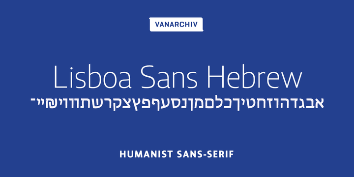
Download Lisboa Sans Hebrew Font Family From Vanarchiv
Lisboa Sans Hebrew is humanist sans-serif typeface, the design approach is much more simple and neutral than Lisboa Hebrew font family. Latin transliteration characters were also included.
Subscribe to:
Posts
(
Atom
)